Violin plots
pesummary has implemented an extension of the seaborn violin plot method to allow for further customisation. Below we document these customisations.
KDE method
The pesummary implementation of the seaborn violin plot allows for the user to specify the KDE method that they wish to use. By default, we use the scipy.stats.gaussian_kde,
>>> from pesummary.gw.plots.publication import violin_plots
>>> from pesummary.gw.plots.latex_labels import GWlatex_labels
>>> import matplotlib.pyplot as plt
>>> import numpy as np
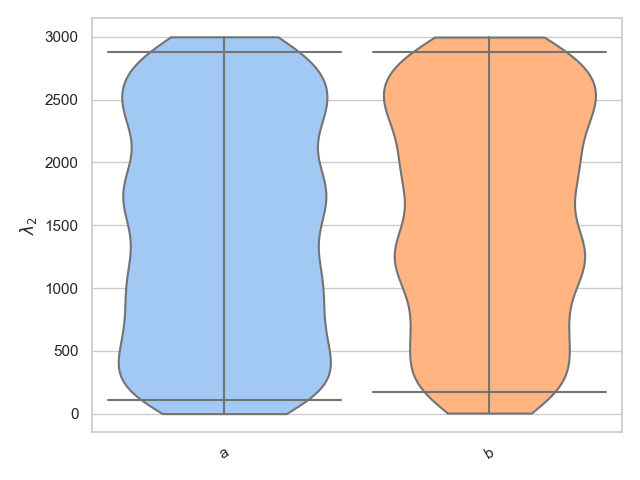
>>> parameter = "lambda_2"
>>> samples = [
... np.random.uniform(0., 3000, 1000),
... np.random.uniform(0., 3000, 1000)
... ]
>>> labels = ["a", "b"]
>>> fig = violin_plots(parameter, samples, labels, GWlatex_labels)
>>> plt.show()
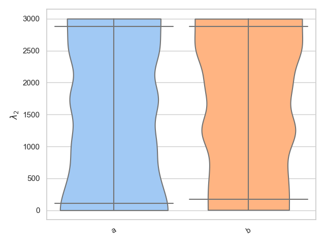
Alternatively, we know that lambda_2 is only defined between 0 < lambda_2 < 3000 and therefore it may be more suitable to use the bounded_1d_kde method implemented in pesummary,
>>> from pesummary.core.plots.bounded_1d_kde import bounded_1d_kde
>>> fig = violin_plots(
...     parameter, samples, labels, GWlatex_labels, kde=bounded_1d_kde,
...     kde_kwargs={"method": "Reflection", "xlow": 0.0, "xhigh": 3000.0},
...     cut=0
... )
>>> plt.show()
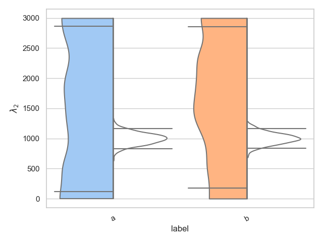
Split
The pesummary implementation also allows for the user to split a single violin in two, showing two different distributions. This is useful for showing the difference between the prior and posterior, for example. Below we show how this is achieved. We choose to color all the left hand distributions according to the pastel palette, and we color all right hand distributions white,
>>> from pesummary.core.plots.seaborn.violin import split_dataframe
>>> left = [
...     np.random.uniform(0., 3000, 1000),
...     np.random.uniform(0., 3000, 1000)
... ]
>>> right = [
...     np.random.normal(1000, 100, 1000),
...     np.random.normal(1000, 100, 1000)
... ]
>>> samples = split_dataframe(left, right, labels)
>>> fig = violin_plots(
...     parameter, samples, labels, GWlatex_labels, kde=bounded_1d_kde,
...     kde_kwargs={"method": "Reflection", "xlow": 0.0, "xhigh": 3000.0},
...     cut=0, x="label", y="data", hue="side", split=True,
...     palette={"right": "pastel", "left": "color: white"}
... )
>>> plt.show()
Real example
Lets now take a real example. Let us download and plot the chi_p posterior distributions for GW190412 on the left hand side, and the chi_p prior on the right hand side (we will utilize the bounded_1d_kde method and the fetch module both implemented in pesummary),
>>> from pesummary.gw.fetch import fetch_open_samples
>>> f = fetch_open_samples("GW190412", catalog="GWTC-2")
>>> posterior = f.samples_dict
>>> parameter = "chi_p"
>>> prior = f.priors["samples"]["combined"]
>>> interested = ["SEOBNRv4PHM", "IMRPhenomPv3HM", "combined"]
>>> left = [posterior[_interested][parameter] for _interested in interested]
>>> right = [prior[parameter] for _ in range(len(interested))]
>>> samples = split_dataframe(left, right, interested)
>>> fig = violin_plots(
...     parameter, samples, interested, GWlatex_labels, kde=bounded_1d_kde,
...     kde_kwargs={"method": "Transform", "xlow": 0.01, "xhigh": 0.99, "apply_smoothing": True},
...     cut=0, x="label", y="data", hue="side", split=True,
...     palette={"right": "pastel", "left": "color: white"}
... )
>>> plt.show()
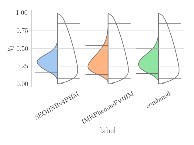
Alternatively, for this case, the same plot can be generated in only 4 lines by using the .plot() method.
>>> posterior = f.samples_dict
>>> parameter = "chi_p"
>>> fig = posterior.plot(parameter, type="violin", kde=bounded_1d_kde, kde_kwargs={"method": "Transform", "xlow": 0.01, "xhigh": 0.99, "apply_smoothing": True}, labels=["SEOBNRv4PHM", "IMRPhenomPv3HM", "combined"], priors=f.priors["samples"])
>>> plt.show()